From 31%
retention to 82%.
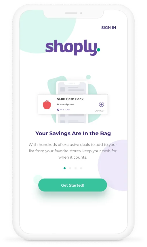
Shoply is a cashback app for online and offline shoppers. V1 was haemorrhaging users: declining conversion, spiking bounce rates, and a retention curve that flatlined after day four. I owned V2 end to end: audit, research, redesign, testing, and a new design system.
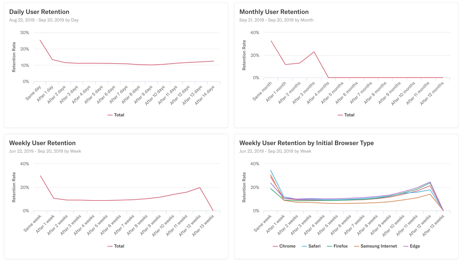
Day 4 was the cliff
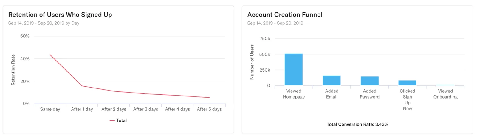
Previous stats showed Shoply V1 was unsatisfactory for users: declining conversion rate, high bounce rate, and a drop in daily active users after four days. Users downloaded the app, poked around, couldn't find value fast enough, and left. To boost conversion and retention, leadership prioritized improving UX. As the lead designer for V2, I began with a design audit to identify the structural issues driving churn.
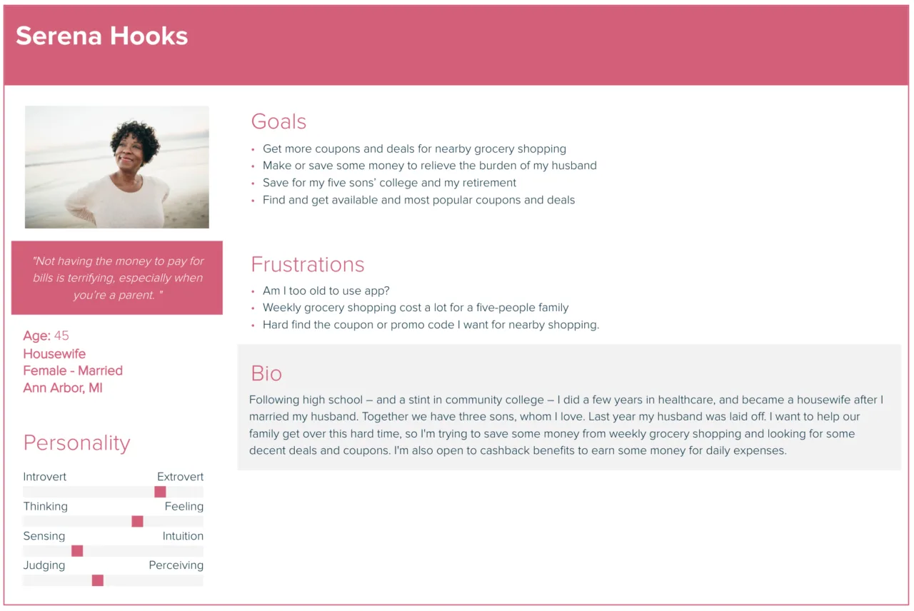
Two users, opposite needs
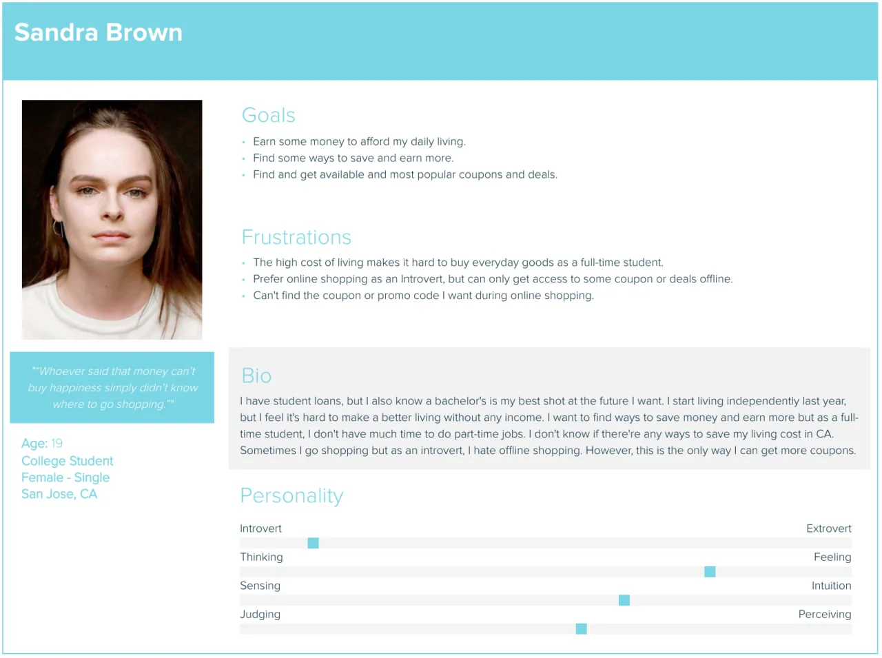
Based on the data from marketing, I developed two distinct persona types to understand user behavior and preferences. They wanted fundamentally different things from the same app:
- Female, 18, College Student
- Prefers online shopping
- Goals: save money quickly, earn rewards
- Wants convenient cashback experience
- Needs clean, easy-to-scan content
- Values user-friendly interface for browsing and purchasing
- Female, 45, Housewife, no college degree
- Prefers offline shopping
- Goals: save money, find nearby store coupons
- Needs quick access to deals and coupons
- Wants easy-to-learn app
- Simple interface, no tech complexity
Broken at every layer
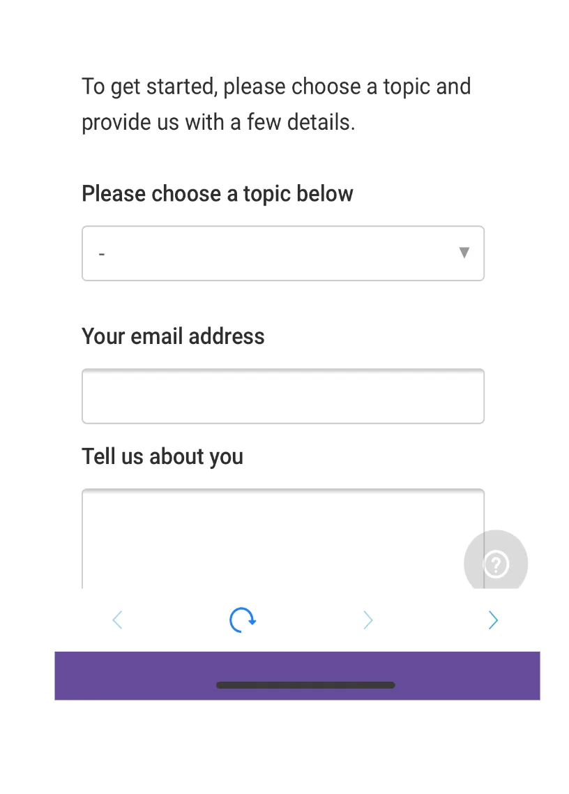
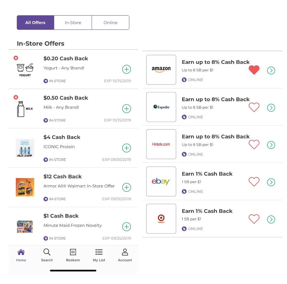
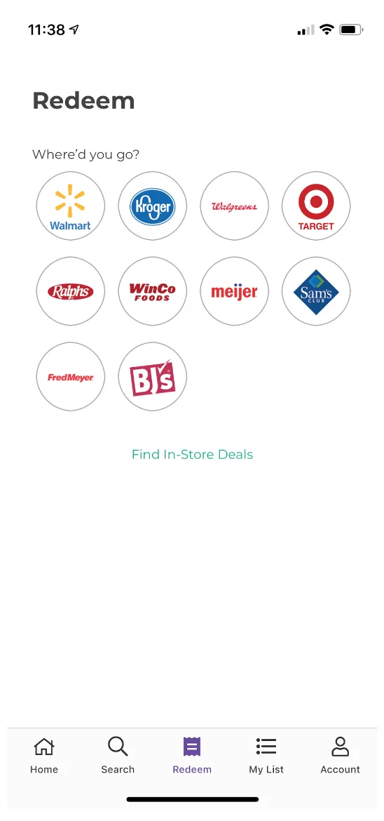
To offer targeted features and effective improvements, I conducted a design audit using heuristic evaluation. The problems weren't cosmetic; they were structural. Here are my primary findings:
- Aesthetic and minimalist design: Lacks visual appeal
- Business goal: No feature/solution intro demonstrating product value
- Flexibility and efficiency: Excessive pre-sign-up questions without skip button, heightening user anxiety
- Consistency & standards: Icons inconsistent in size and style
- Aesthetic design: UI lacks engagement; font sizes too small for older adults; icons and text blend together
- Recognition vs. recall: After adding offers, users can't find saved offers
- Flexibility: No search bar, no sorting by popularity, time, or location
- Recognition vs. recall: Users unsure where to upload receipts; logos not clearly indicated as clickable
- User control & freedom: No immediate feedback (success/error) after uploading receipts
What the best cashback apps got right
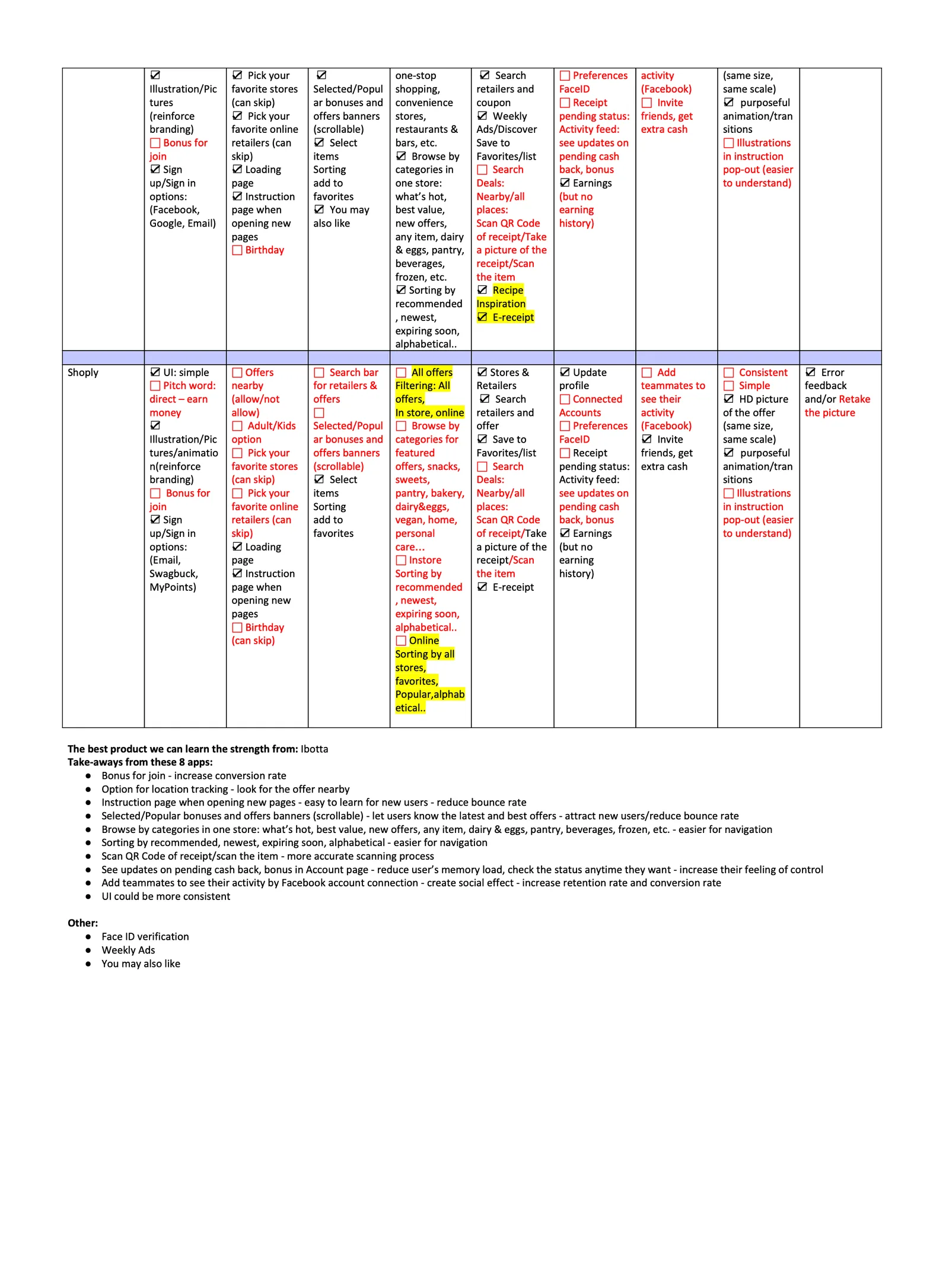
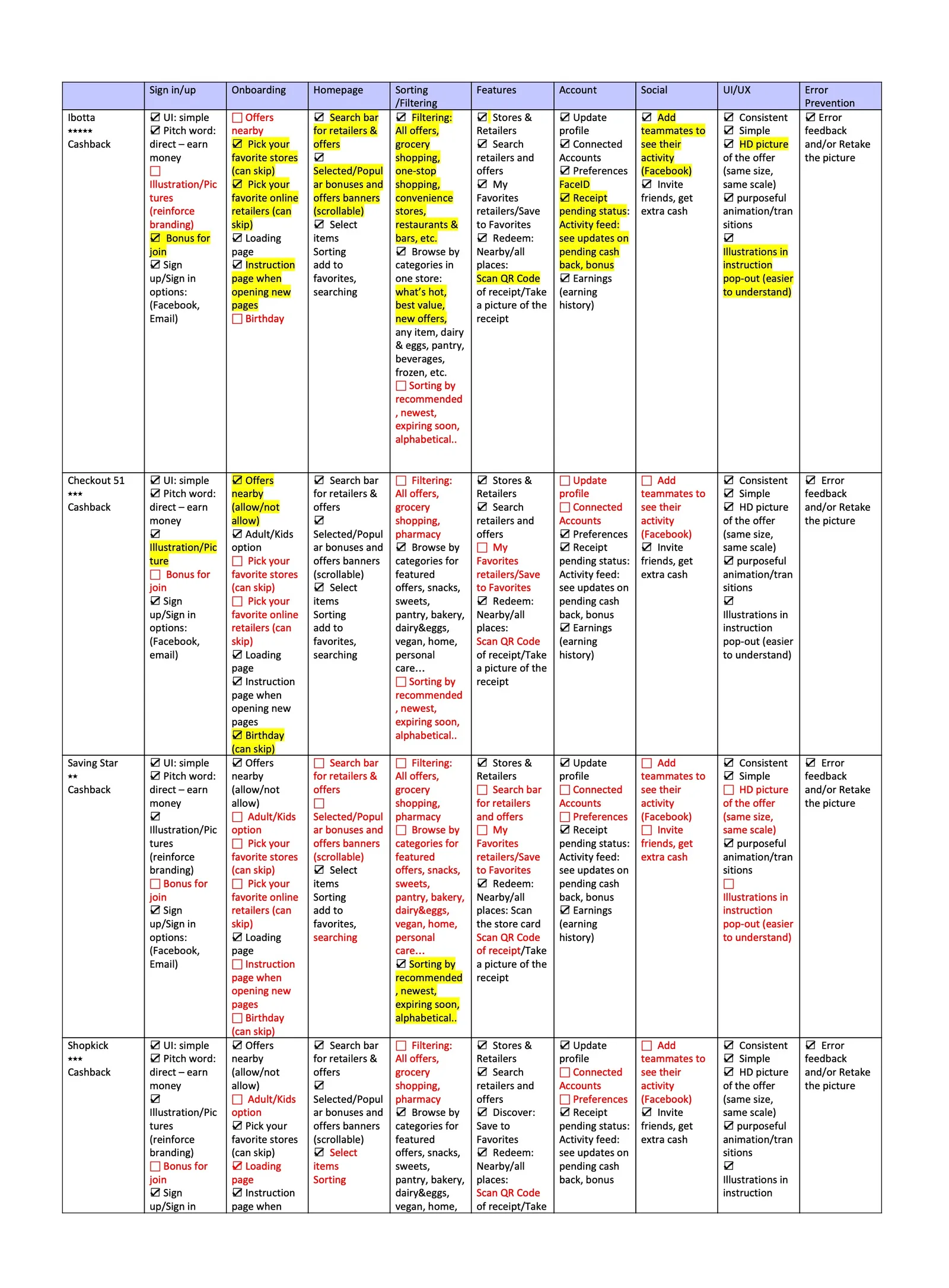
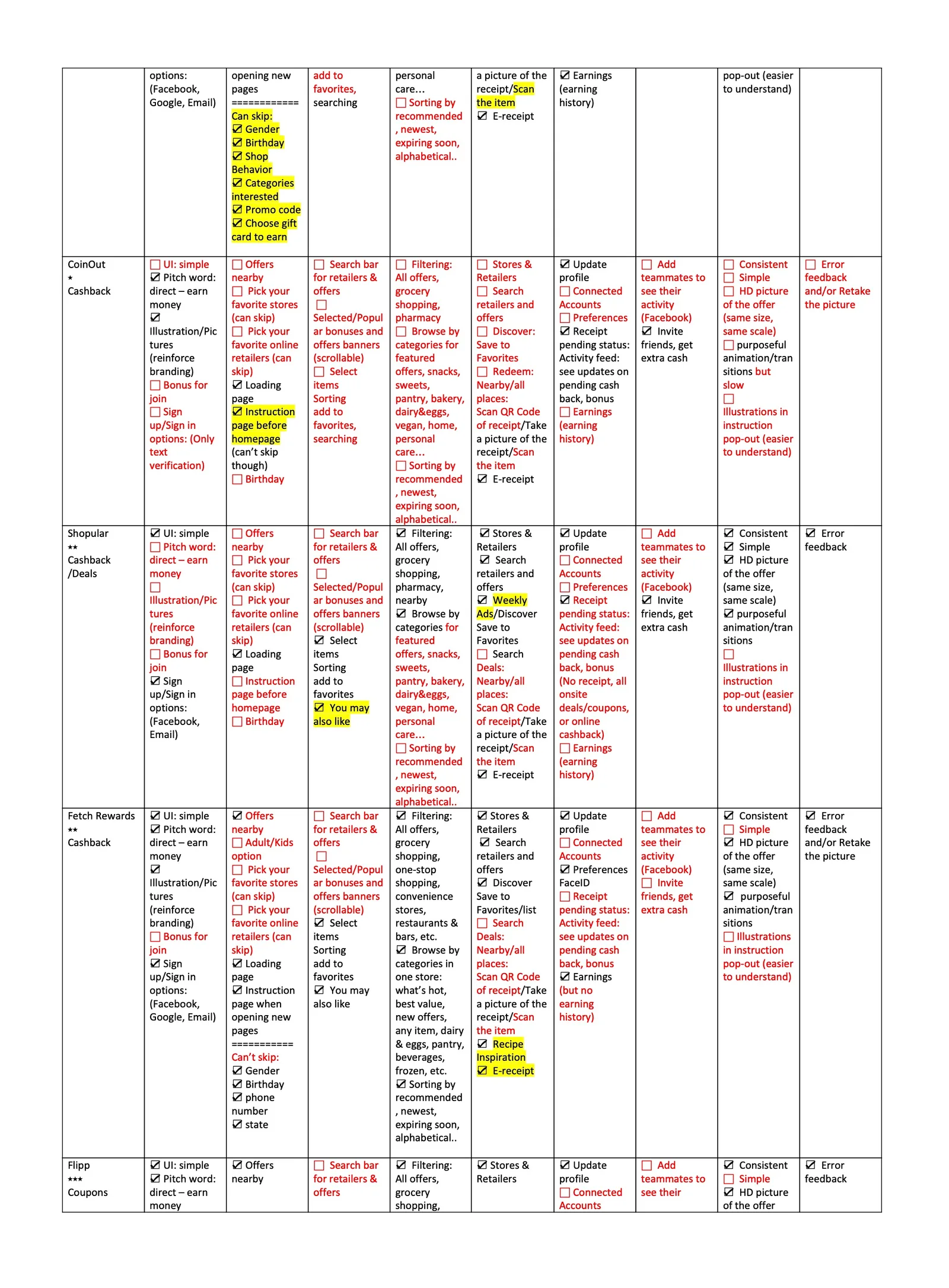
After self-assessment, I conducted a competitive analysis on 8 products across 9 dimensions (UX/UI, error prevention, onboarding, info sorting/filtering, etc.) and presented the findings company-wide. I highlighted strengths to learn from and weaknesses to avoid, concluding with key takeaways for future upgrades:
Top takeaways from Ibotta and 8 apps
- Join bonus to boost conversion rate
- Location tracking to find nearby offers
- Instruction pages for easy onboarding, reducing bounce rate
- Scrollable offer banners to attract users
- Category browsing to simplify navigation
- Sorting options to enhance findability
- QR code scanning to improve accuracy
- Cash back updates to increase user control
Other inspirations
- Face ID verification
- Weekly ads
- "You may also like" suggestions
- Facebook connection to boost retention
- Improve UI consistency across screens
Aligning the team before building
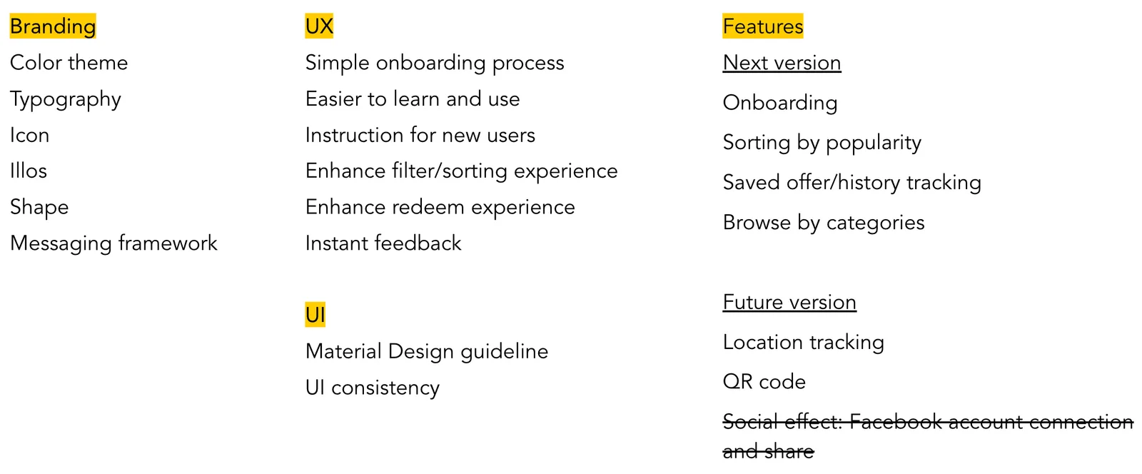
Based on all the data and findings from our research, I facilitated a comprehensive card sorting session with stakeholders. This session was instrumental in confirming and aligning on the prioritization and organization of features, optimizing the user experience, refining branding elements, and ensuring coherence across the user interface.
Rebuilding the user flow
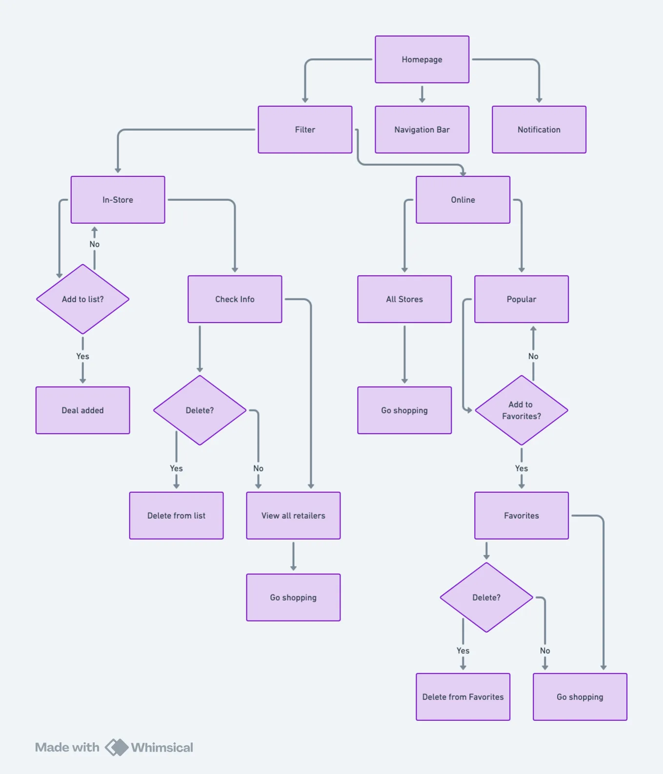
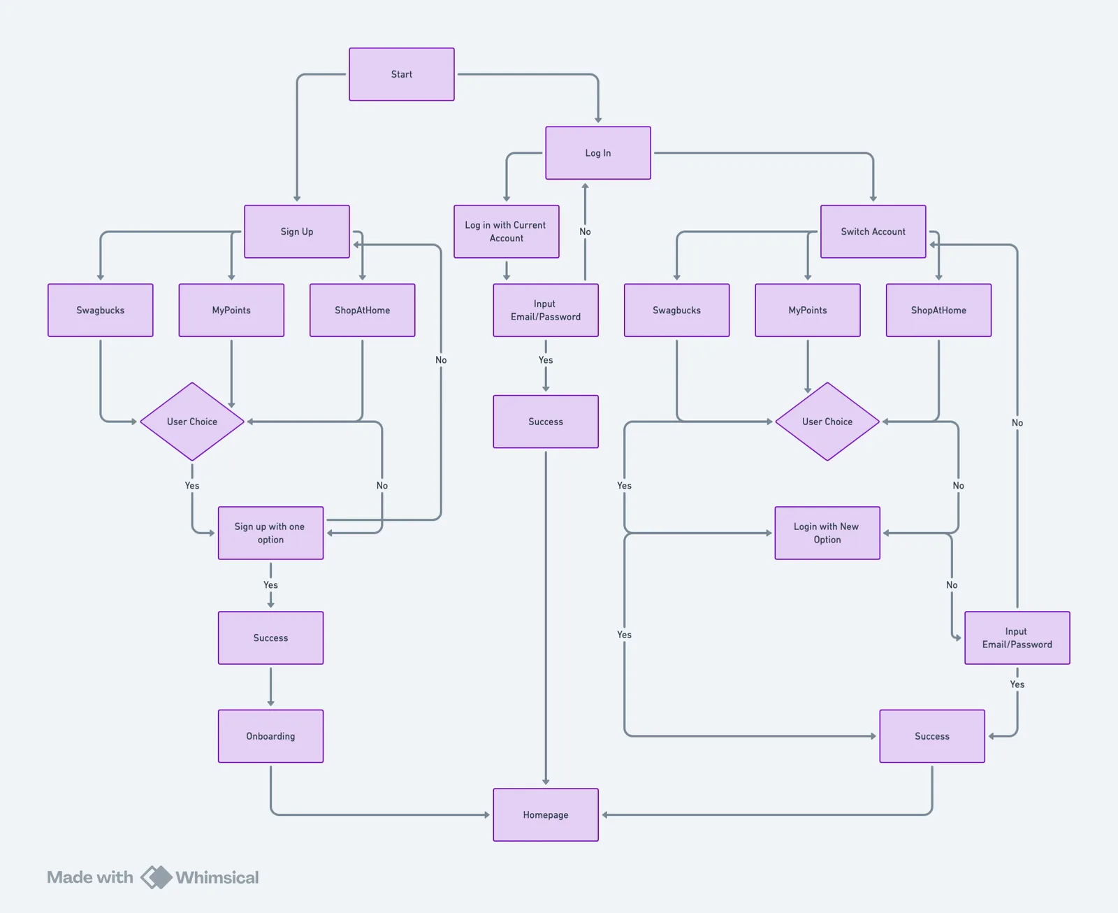
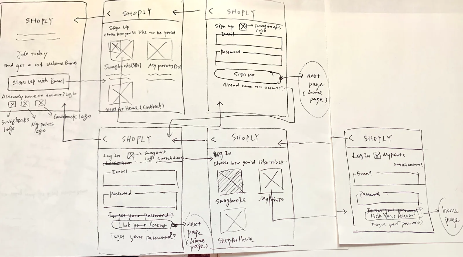
Research revealed logic issues in Shoply, making it hard for users to find and redeem deals. To address this, I created user flows and discussed navigation, hierarchy, categories, and sorting with the PM and devs. The goal was to make the app intuitive and streamline the design process around clear principles:
- Clarify information hierarchy for clear understanding
- Enable quick navigation throughout the interface
- Ensure no dead ends in user journeys
- Allow easy backtracking and backward navigation
- Prevent misoperations with clear affordances
From whiteboard to alignment
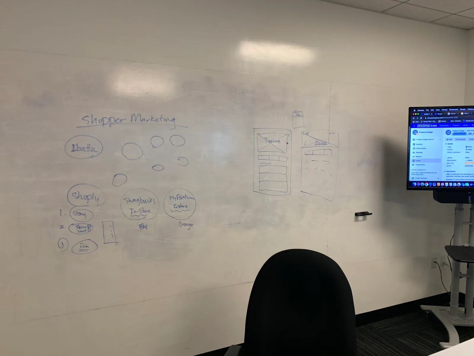
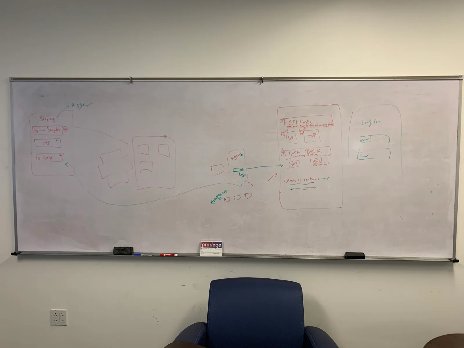
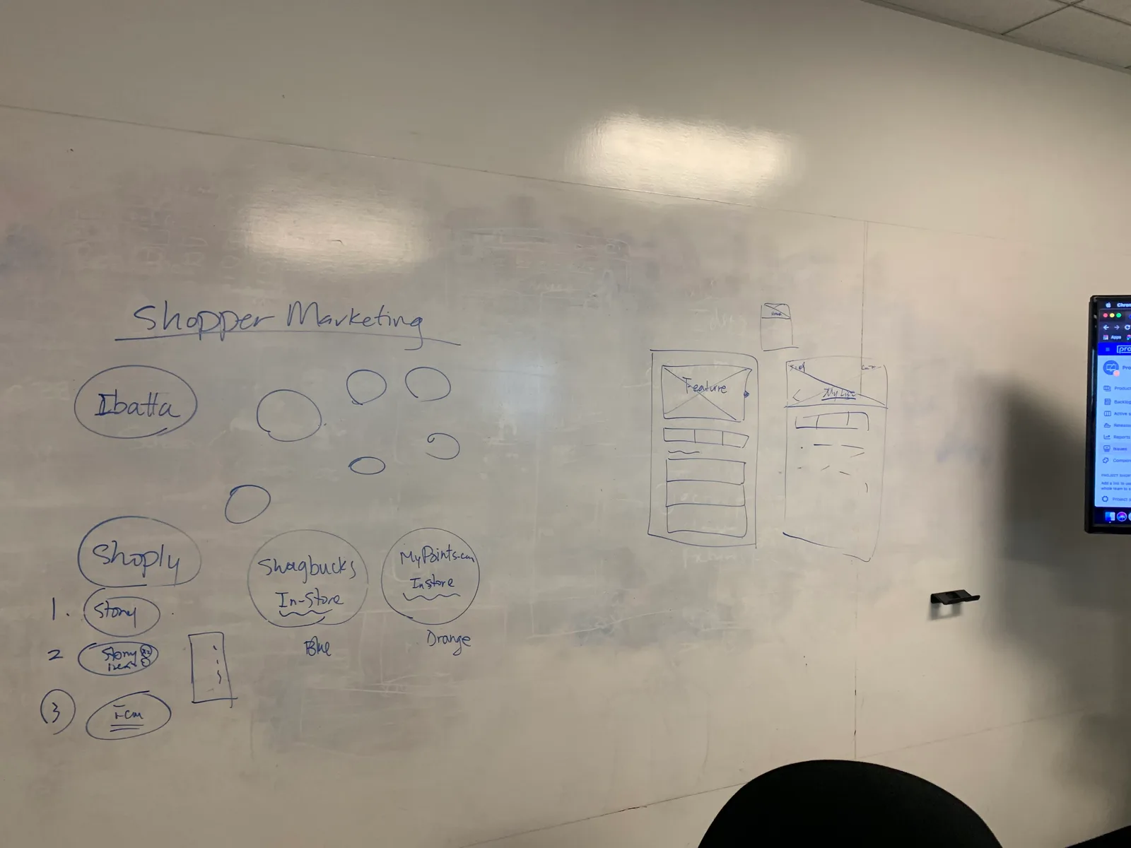
With the architecture complete, we moved to the design phase. Instead of starting with the UI library, I wanted stakeholders on the same page about timeline, components, and layout to avoid rework and deliver on time. I created wireframes and whiteboarded with the team to:
- Confirm the logic, triggers, and flow with marketing, product managers, and developers
- Align sprint planning with story points to manage timeline and workload effectively
- Arrange elements and layout for optimal user experience
High-fidelity prototyping
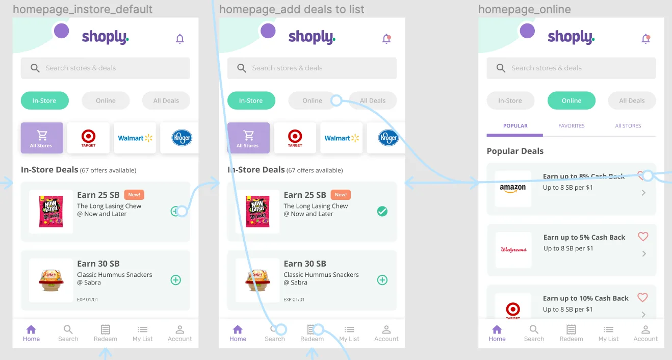
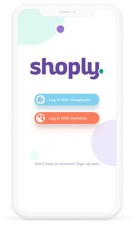
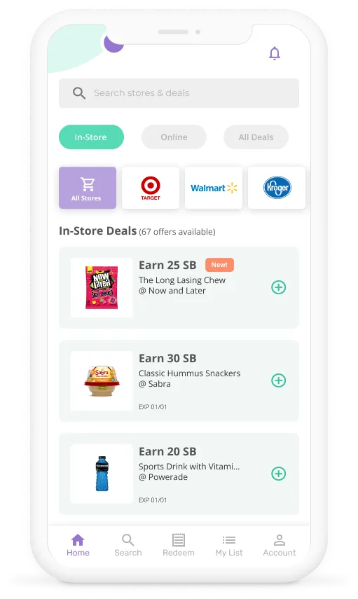
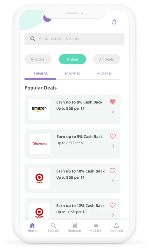
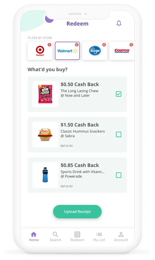
High-fidelity designs were created to mimic the real product for devs and user tests. The redesign addressed the issues surfaced in the audit, and a new UI library would be built after positive user feedback. Here are the primary enhancements:
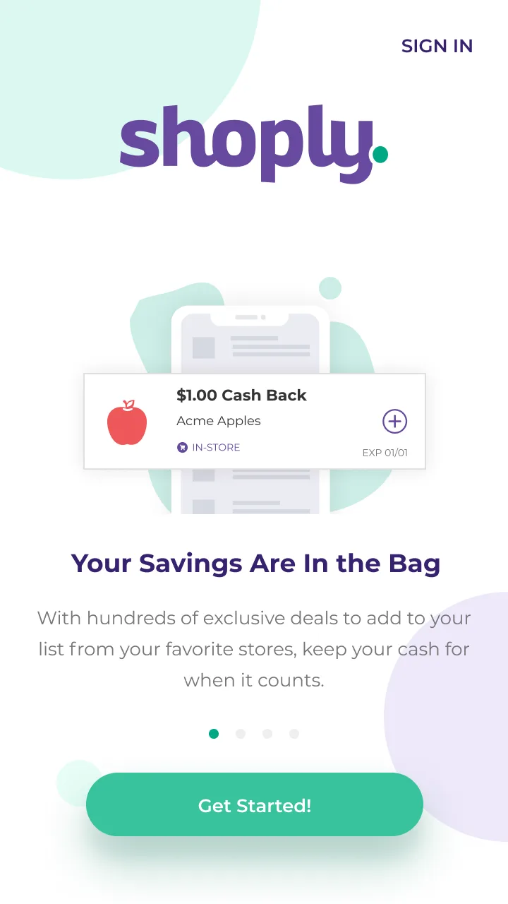
Onboarding enhancement
- Simple and intuitive onboarding process
- Clear calls-to-action (CTA)
- Replace lengthy text and questions with visual elements
- Concise copy to communicate product value
Homepage enhancement
- Integrated search bar for improved navigation
- Clear content hierarchy through color, typography, and sequence
- Effective notification systems
- Minimalist UI with consistent branding
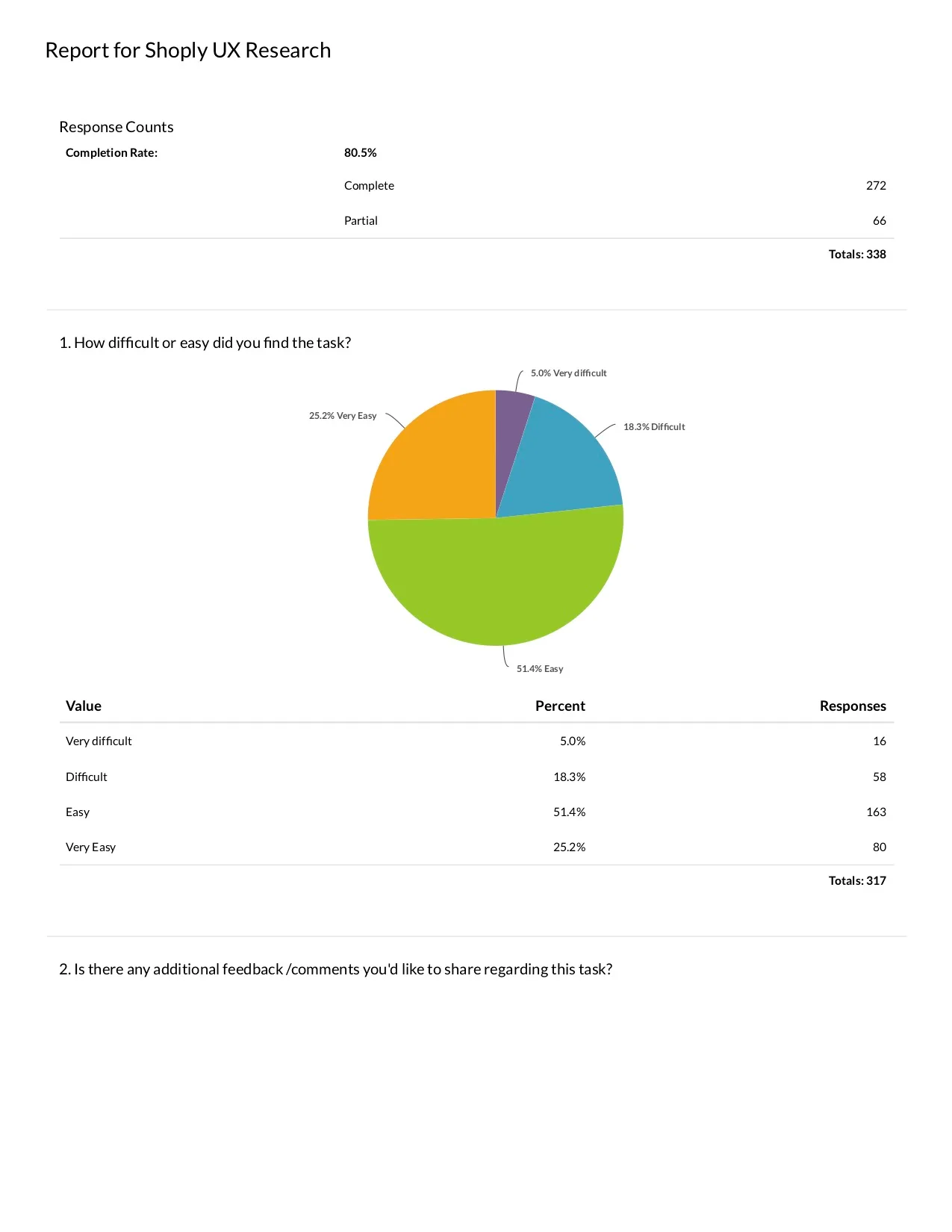
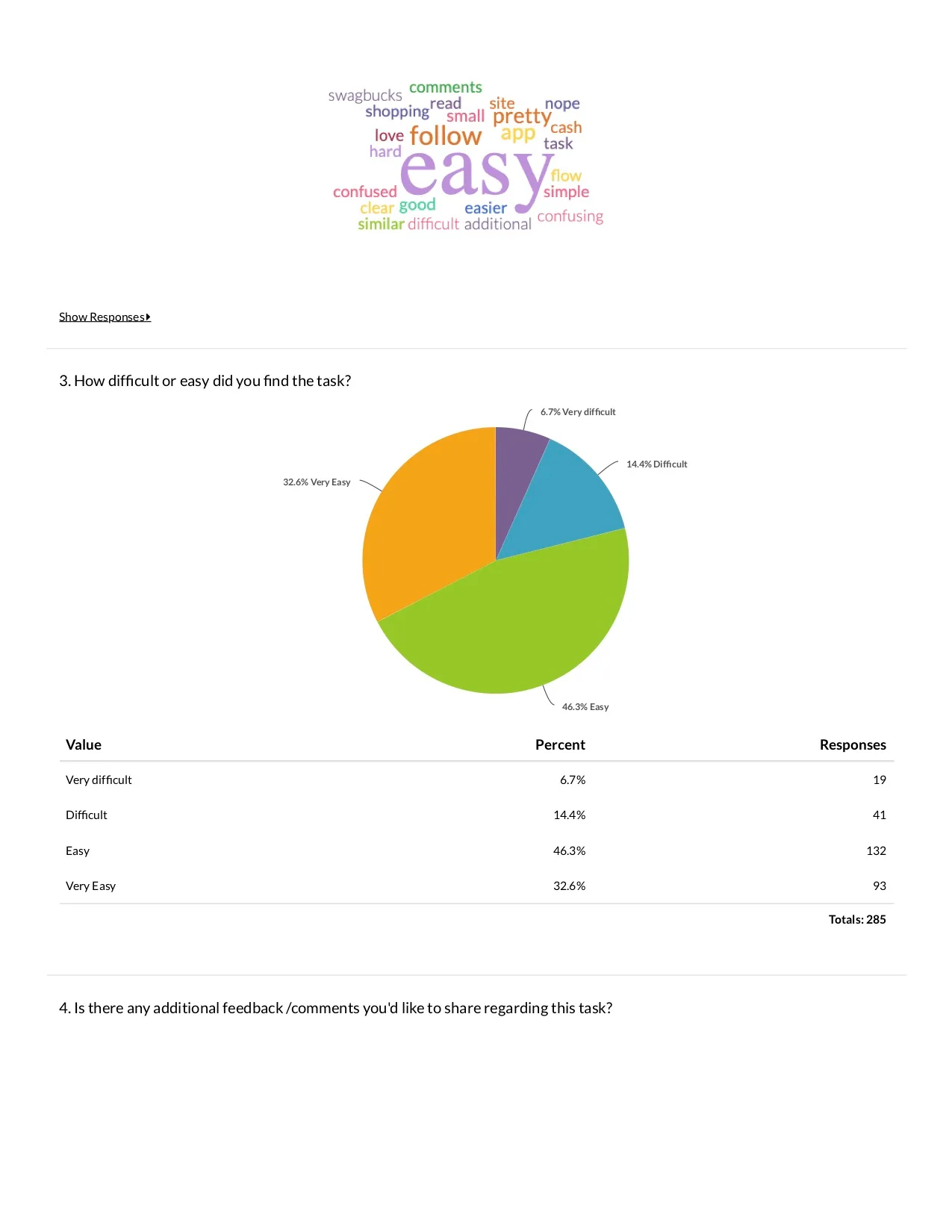
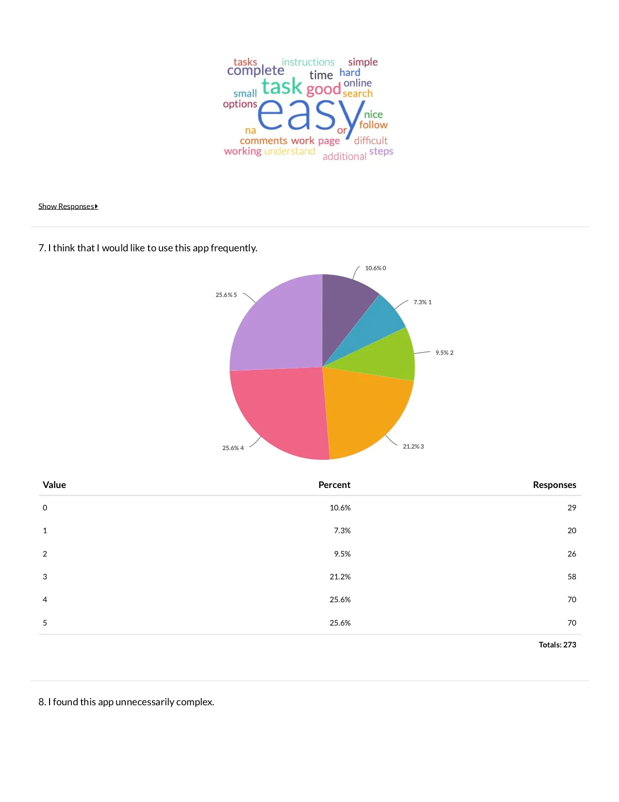
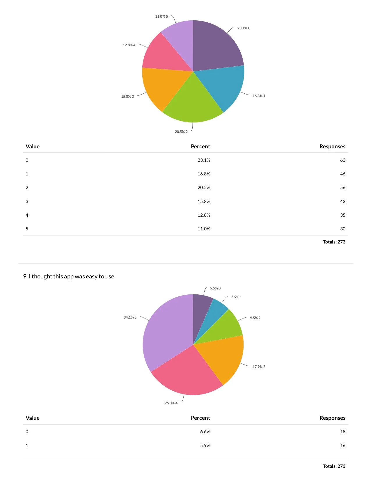
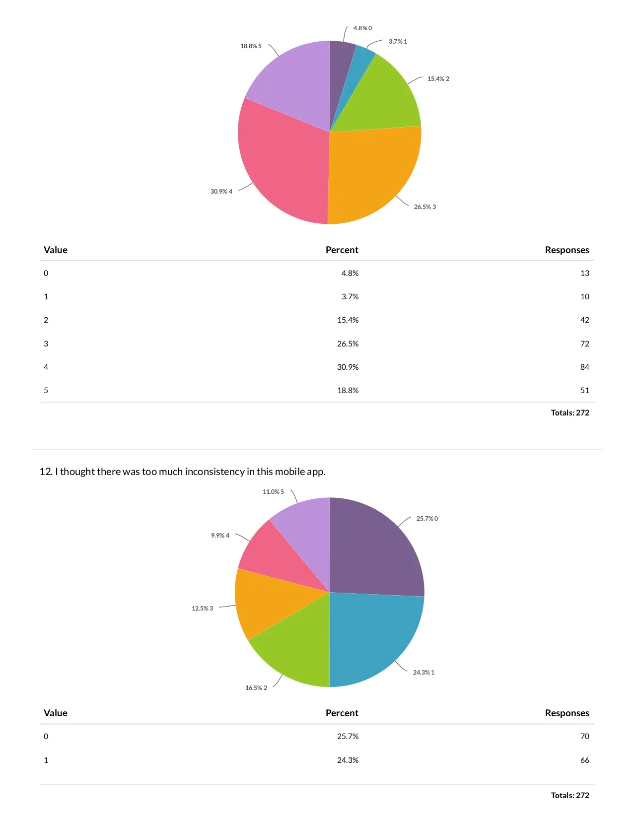
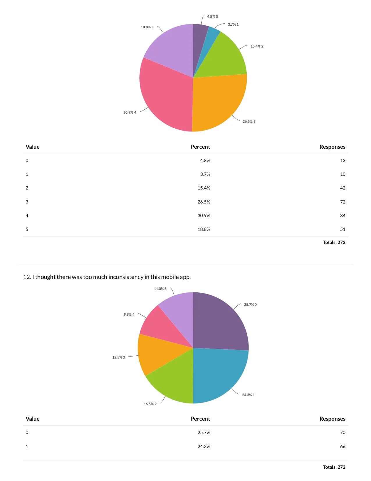
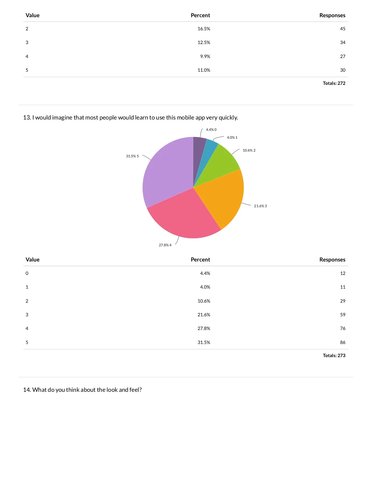
272 users confirmed the direction
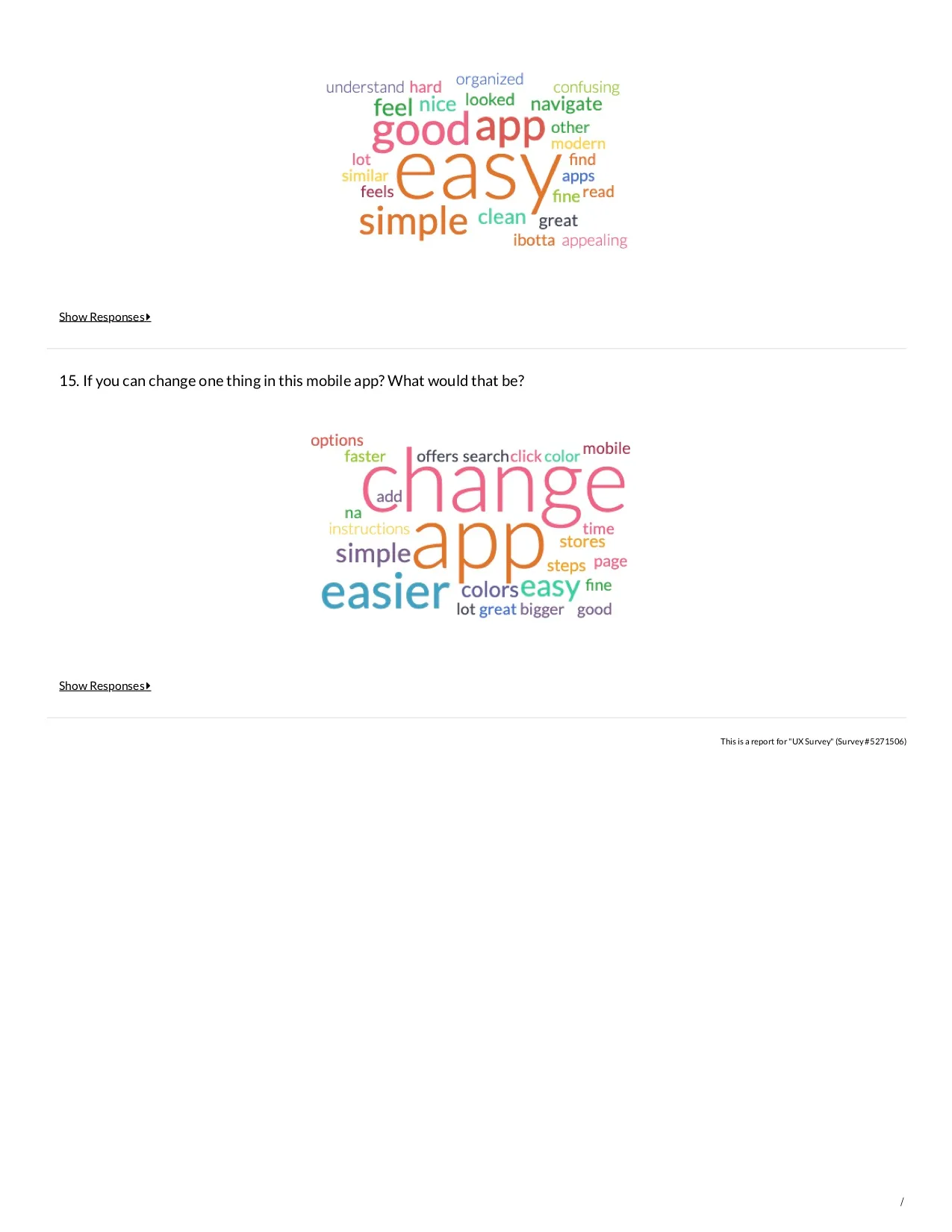
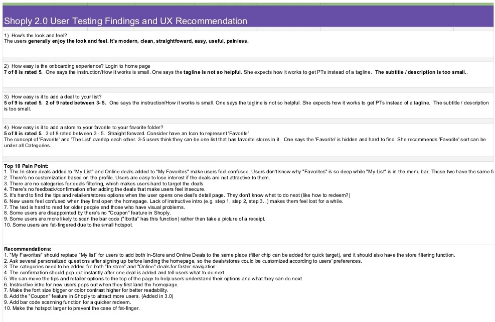
I invited 338 users for an online survey; 272 completed usability tests. Users performed three tasks and shared honest feedback anonymously. The new design showed high engagement and satisfaction:
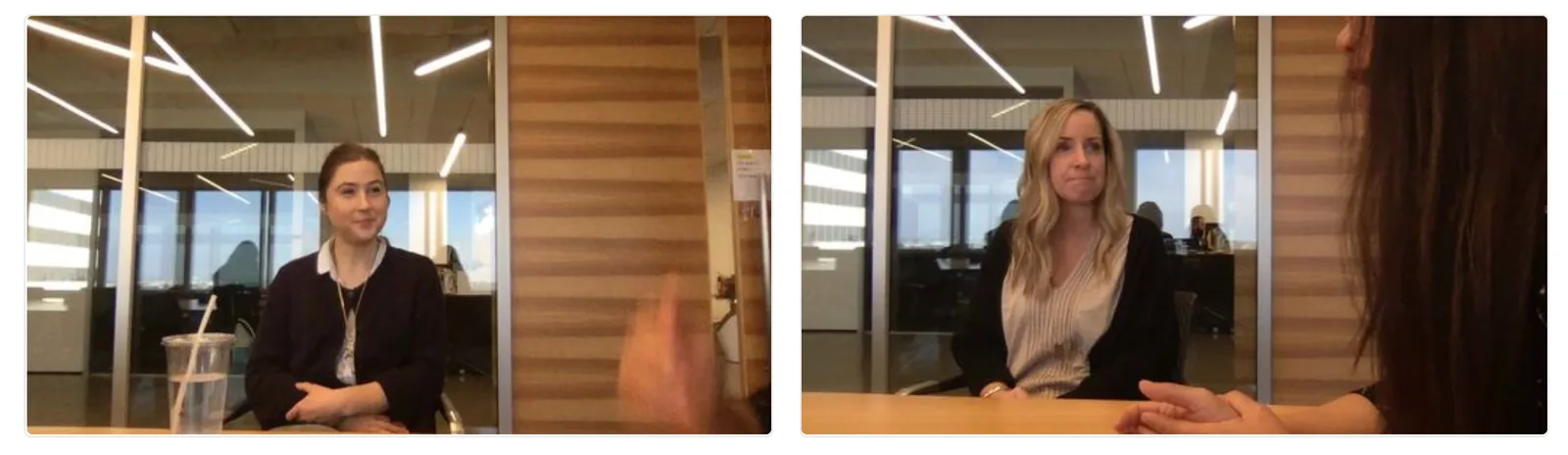
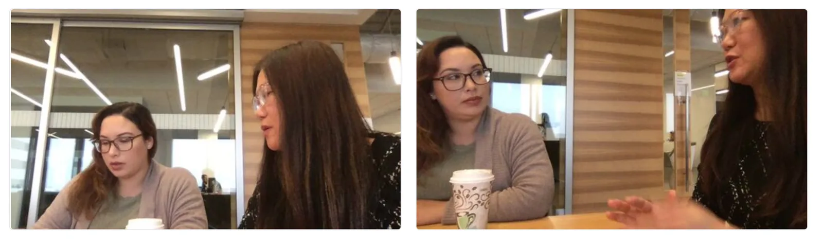
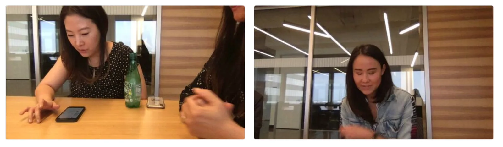
To gather first-hand qualitative data, I conducted think-aloud tests with a researcher, focusing on constructive advice. Over ten users participated. From survey and think-aloud results, I presented the top 10 user pain points and my recommendations and brainstormed with stakeholders. Considering user needs, project due date, and engineering feasibility, I finalized the V2 iteration and began planning the V3 product strategy based on our data.
Final design samples
The retention curve bent
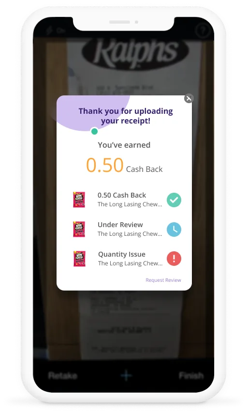
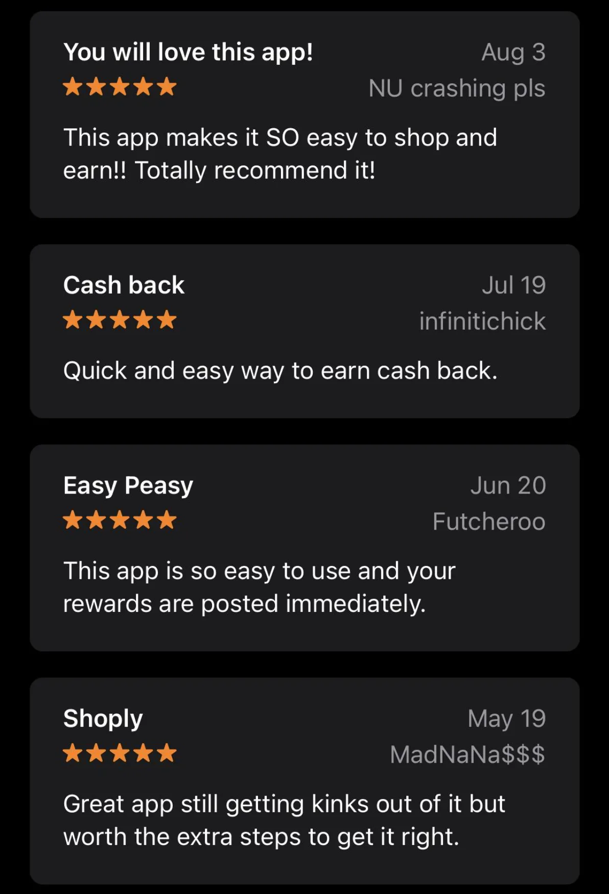
Shoply 2.0 achieved notable success. V2 didn't just fix individual screens; it fixed the system. Every heuristic failure from the audit got a targeted solution:
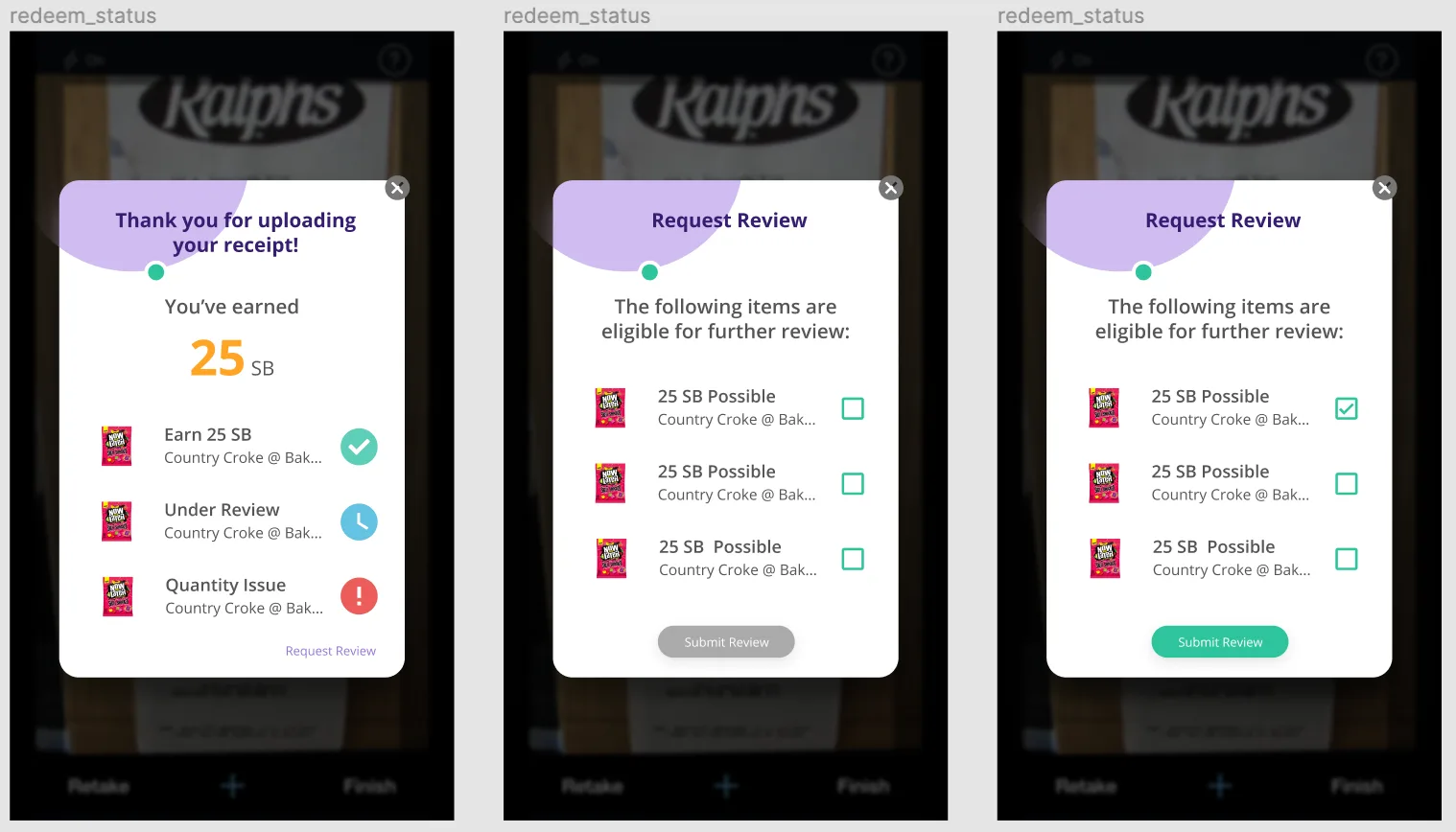
- Visibility of System Status: Instant confirmation after adding deals and uploading receipts, informing users of actions taken and next steps
- Consistency & Standards: New UI library clarifying information hierarchy across every screen
- Error Prevention: Error messages with clear instructions for fixing issues
- Aesthetic & Minimalist Design: Sorting and filtering for a concise, logical homepage display
The real lesson: V1 failed not because individual screens were bad, but because no one owned the system. Icons, hierarchy, feedback loops, redemption flows were designed in isolation. V2 worked because I treated the entire app as one connected experience, not a collection of screens.
Research and ideation are essential to streamline the design process, avoiding unnecessary back-and-forth. Balancing business goals with user needs is crucial, and inviting developers and PMs to join the ideation process early on saves time and effort, ensuring usability and feasibility are harmoniously aligned.
Let's close
a gap together.
I'm looking for teams where research drives the roadmap and design ships, not just specs.